Ideas, events, and publications from our library collections
-
Sad farewells
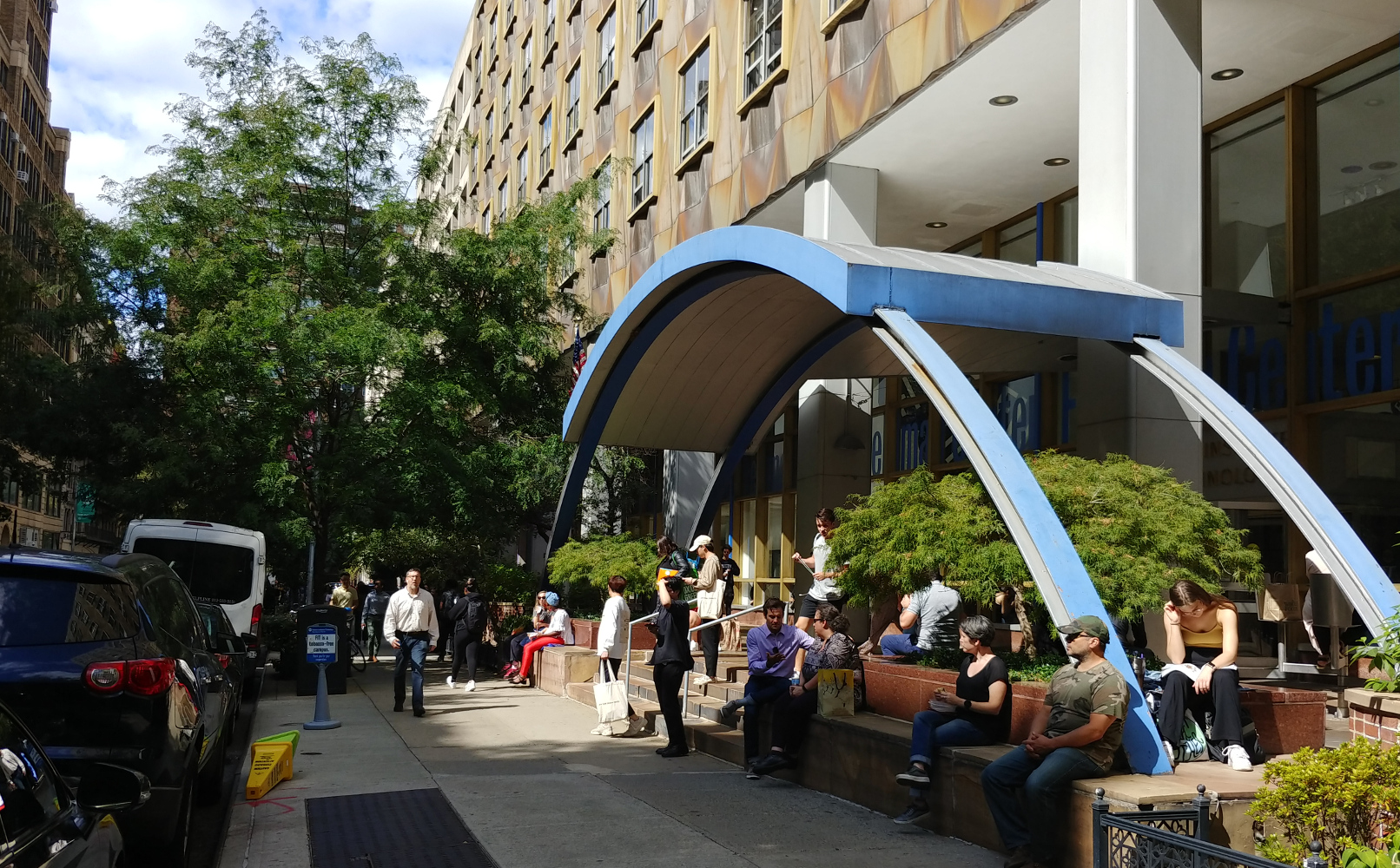
Hi, everyone, We’ve been busy the last few weeks with the new semester. FIT students are back on campus, which means they’re back in classes, which means they are back to using the library non-stop. From library orientation classes to new books and a new online catalog of our materials, library workers have been super…
-
Stonewall’s 50th Anniversary
We’re busy with other projects besides the blog this summer, but we didn’t want an important anniversary to go unrecognized. This summer is the 50th anniversary of the Stonewall raid which began the Gay Pride movement. I’ve written a lot about it before, and you can read that here: The Power of Love to Dispel…
-
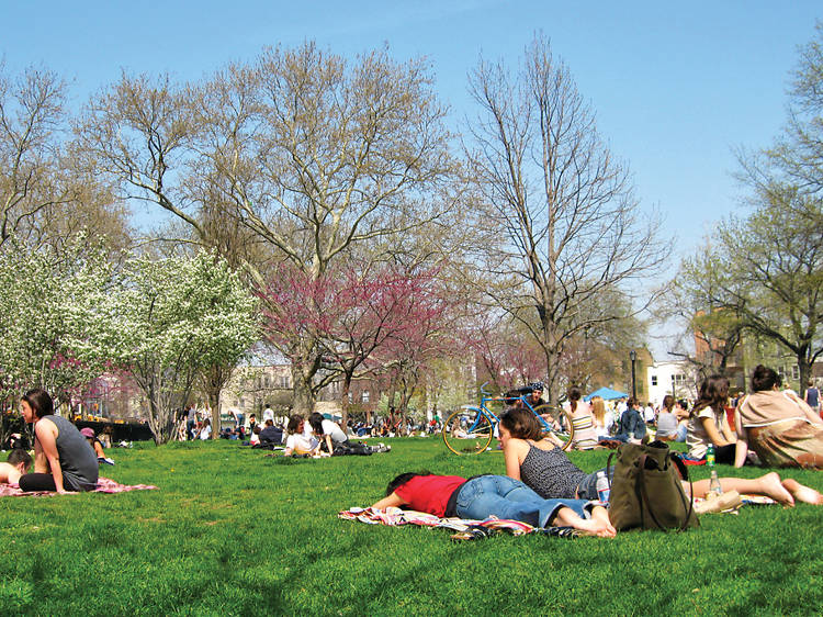
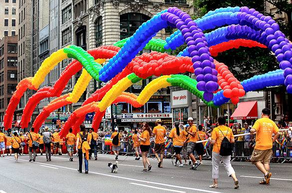
Summer in New York City!
Hi everyone! In the FIT Library, we’re switching to a new e-system, so it’s pretty busy. Just so you know we haven’t forgotten about you, here are some reminders about cool things to do in the New York area. New York, your summer playground June is parade month in NYC. Here’s some background on the…