How do you get the legend to be correct without editing it after the chart shows up?
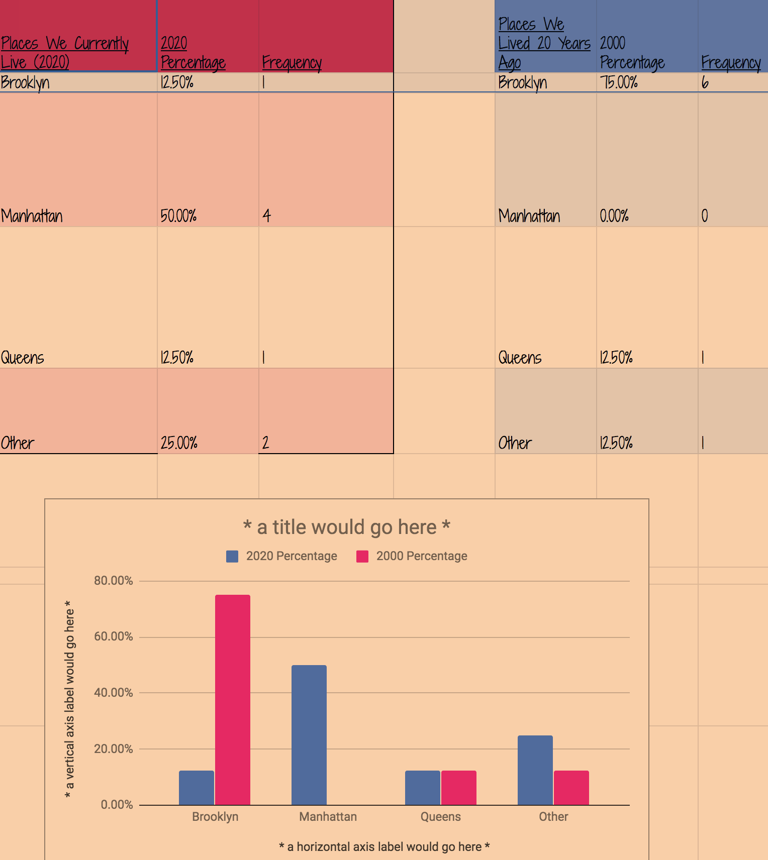
ANSWER: So, in the last few years Google does make it a bit tricky to edit legends in charts for some reason. One quick solution is to write down what you want the legend to say in spreadsheet cells. For the module 2 spreadsheet you are asked to make any chart but many students choose to create a column chart comparing current data with older data. I enjoy these charts but a legend is necessary to know which color corresponds to which data set.
Here is what I do:
- In this case I am going to make a chart looking at the percentages. (If you were making one with frequencies then you would be labeling the frequencies.) To make a distinction I edit the label percentage for each data set so they are unique and clearly represent each data set. In this case I am going to write 2020 percentage and 2000 percentage.
- What the first rows look like:
Places We Currently Live (2020) 2020 Percentage Frequency Places We Lived 20 Years Ago 2000 Percentage Frequency Brooklyn 12.50% 1 Brooklyn 75.00% 6 - That’s really it! You highlight ALL the cells that have the data you want including the headers/descriptive word cells and it will show up in the legend:
-
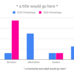
chart with correct legend 
creating an accurate legend with google spreadsheets