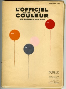
 During the 1950s, L’Officiel de la Couleur des Industries de la Mode and its associated publication, Cahiers Bleu, served as trend forecasting publications for the fashion industry.
As their titles imply, color forecasting was the foremost mission of both publications, L’Officiel de la Couleur being established first and Cahiers Bleu following as, “By definition, we have, in L’Officiel de la Couleur, looked to the future; it was then necessary for our publication to bring information to its readers in the shortest time possible; so it became impossible to report on Couture and Textile stories that may delay, up to a month, the release of L’Officiel de la Couleur…How does one pay a worthy tribute to the best practitioners of couture, and the great creators that are fabric manufactures? With Cahiers Bleus, the question is no longer. Forty-five couturiers are featured; close to fifty models are presented; the greatest names in textiles are contained within.” Renderings of designs by well-known maison de couture such as Dior, Schiaparelli, and Balenciaga appear alongside other houses whose names have slipped from the collective conscience with the passage of time, making the publications excellent sources of hard-to-find information, in both visual and text form, on now-defunct segments of the Parisian haute couture industry.
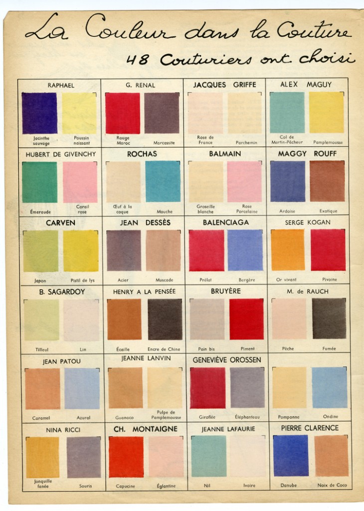
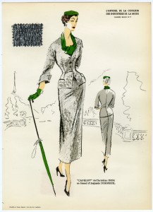
Both publications featured amusing ‘bonuses’ attached to each sketch; in L’Officiel de la Couleur this took the form of color swatches, while Cahiers Bleu took things another step further by including swatches of actual fabric used to create the garment pictured. Doing so promoted both designer and textile manufacturer, a relationship that was widely-publicized during the 1950s. Advertisements and editorials appearing in main-stream fashion magazines of the period, such as Vogue and Harper’s Bazar, regularly highlighted the textile used in a featured look, even naming its manufacturer.

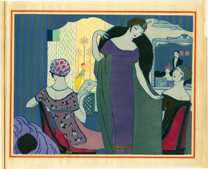
In keeping with the luxury brands and textiles they featured, the magazines themselves were produced using the laborious method of pochoir to apply color to each and every page by hand. Pochoir, which means stencil in French, had its heyday in the 1910s and 1920s when it was widely adopted by the era’s cutting edge illustrators such as Paul Iribe, Georges Lepape, George Barbier and André Édouard Marty for their illustrations that appeared in ultra-exclusive fashion and lifestyle magazines such as Gazette du Bon Ton, Journal des Dames et des Modes and Modes et Manières d’Aujourd’hui; the works that appear in their pages are among the supreme expressions of the pochoir technique, requiring up to 100 separate stencils, in perfect registration with each other, for the colouriste to execute the illustrators’ elaborate compositions. Because of the cost associated with production, the use of pochoir largely died out in the economic downturn of the early 1930s.
L’Officiel de la Couleur and Cahiers Bleu are two of the few fashion publications that continued to use the technique into the 1940s and 1950s, regardless of expense. Perhaps this is because of the extraordinary range of colors and levels of transparency available with the use of impaste or chemical color mediums; “Impastes were thicker and more solid and number about fifty colors. ‘Chemicals’ were preferred because of their transparency and extraordinary range. More than 1,400 were available.” Compared to the limited-edition fashion publications and artist books of the Teens and Twenties, the use of pochoir in L’Officiel de la Couleur and Cahiers Bleu is relatively simple. Each color appearing on the page indicates the use of a different stencil which was laid upon the page, which had been previously printed with the black lines of the illustration. Brushes, gudgeons or pompons were used to apply the colors, one at a time, to the page. Rarely do more than three to five colors appear per page, translating to an equal number of stencils, or patrons, required.
The customer-base for this publication was clearly international as it was concurrently published in French, English, Spanish, and Portugese with the promise that readers would be advised “each quarter…on the colors which are to be in vogue in the upcoming season, via this “veritable work of art,” which was “highly sought after by book collectors.”


5 responses to “The Color of Couture”
Magic post. We re-blog this! Just to see the colors, and especially from pochoir fashion prints of Jeanne Lanvin, Jean Patou and Maggy Rouf is a rare treat. All those long forgotten names too, many of whom were the instigators of style trends, but were eclipsed by better financed and bigger names who often – lets face it – nicked their ideas.
Both L’Officiel de la Couleur and Cahiers Bleu represented an ethic in art and style that reaslly reached its zenith by the 1960s. I collect old pochoir magazines and they are hard to find. .
Thank you for your kind words. If you’re a collector of pochoir, you will be excited to hear that our book Fashion and the Art of Pochoir is forthcoming (published by Thames & Hudson) in 2015. It will contain more than three hundred pochoir fashion illustrations from between the years 1908 and 1922. We will let Material Mode readers know when it’s out!
thanks for that April. Love the blog by the way. I see you procured an original L’Art de la Robe from 1911. It is so hard to find complete copies of any of Poiret’s fashion publications. I have two loose pochoirs from that article I got on Ebay. Quite exquisite.
By the way “Les Robes de Paul Poiret” – illustrated by Paul Iribe in 1908 is now available on the Internet Archive – in case you haven’t seen it.( https://archive.org/details/lesrobesdepaulpo00irib).
Hello April, I’m writing this because I want to ask permission to use the second image for a website designed to help students learn the different colours in english and spanish, this one: colores-en-ingles.net Hope there’s no problem 🙂
Very nice post, I am going to keep reading your blog to discover all our post