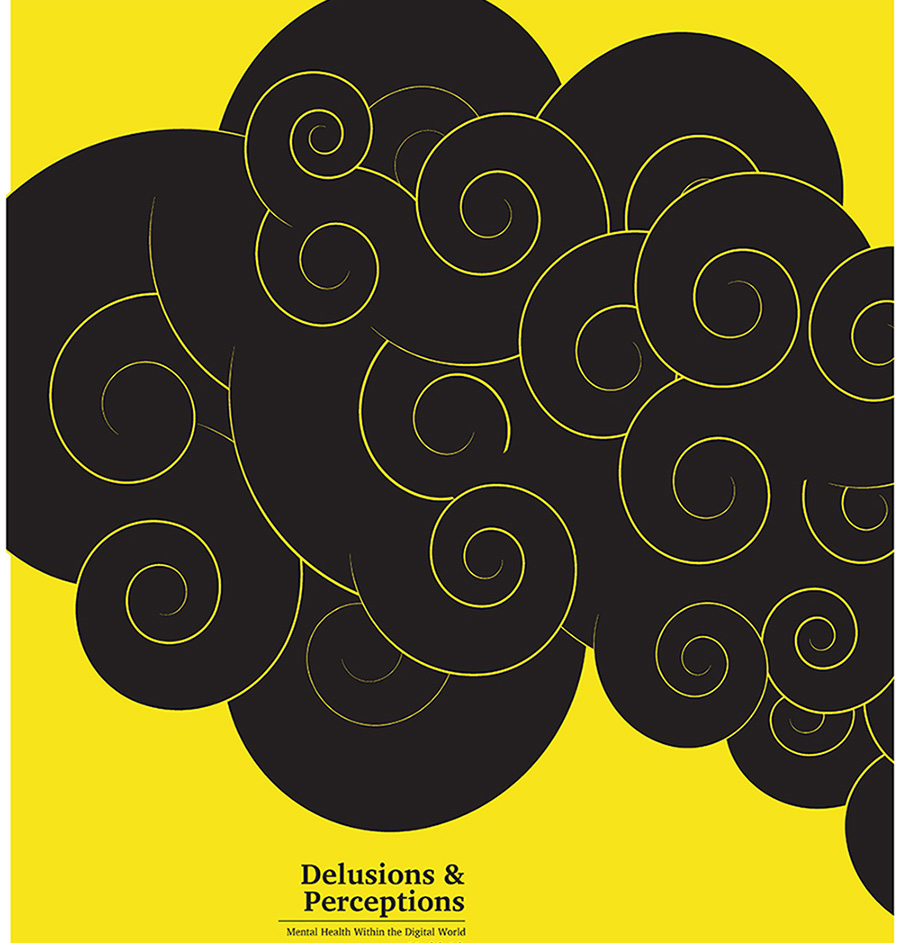
Graphic design student Mariam Khan (’20) is immersed in a digital world. One can see quickly that she excels at merging imagination and digital design, her medium of expression, to great effect. Born into a technology era considered synonymous with “Generation Z,” she is ever aware of its perils, of the mental distress and maladies that affect her generation.
“Don’t Tryptych,” a recent graphic design poster event in the Great Hall, gave us an opportunity to talk to Khan about her work.

A graphic design triptych is a three-panel artwork that can stand individually or together. Khan explains that the challenge is to design a piece on an individual topic that has a cohesive message.
“For our Graphic Design 345 Core Studio I class,” she says, “we were asked to design a triptych for a symposium. We created a list of potential topics, ideas, points of view related to address the controversial world of Generation Z. I narrowed my topic to issues of mental health within the digital world.”

“There are ideals, taken as standards, that we struggle to follow — the pressure to look a certain way, act a certain way, to have a perfect life. Trying to achieve false standards for acceptance leads to anxiety and persistent self-scrutiny,” says Khan.

It is encouraging to see the students tackle the bigger issues of our day in their work as designers. Mariam Khan’s posters demonstrate how effective visual communication can greatly be a tool for provoking thought.” – Troy Richards, Dean, School of Art and Design

“My intention for this design,” says Khan, “was to shrink and condense the elements in my illustrations and show them ‘moving’ though the panels. This represents the connection to my subject matter, mental issues.”
Khan was inspired by Japanese woodblocks like Hokusai’s “Great Wave,” which “is powerful in the way it ‘pushes’ the eye in an intended direction. The aesthetic has always drawn me in. I wanted a minimalist palette because the illustration is powerful itself. The feeling of anxiety is strong, so I chose the colors yellow and black.”

Khan employed juxtaposition to provide contrast between the titles of each panel. “They communicate my idea for the triptych. For instance, “Anxiety & Self-Scrutiny” are paired together. There’s a contrasting effect that communicates the overall idea,” she says.

For her second poster set, juxtaposition is rendered with cut-out letterforms including a digital typeface. “It’s to show how the digital world breaks through and mixes into the real world. I was inspired by [graphic designer] David Carson’s work. I wanted to create something busier than the cleaner look of my first triptych.”
Khan cropped her titles so they show through the cutout letterforms. “It’s a good thing when your audience digs deeper to figure out your concept. Also, some letterforms became more interesting to look at with digital type around it.”
After cropping, the cutout became her imagery and the digital type gave the titles and additional information. She used green type to represent the digital realm along with a gray background to give attention to the imagery itself.

In her third triptych, analogy and metaphor come into play. She manipulated symbols as part of the design. “I wanted to use something to show what’s not real, a standard versus a standard, and the idea of pure thoughts decaying,” Khan says.

Designing the third triptych was easier after her experience with the first two. “I already had ideas. I used images that show the distortion of delusions, the standards of a Barbie versus a Bratz doll, using a decaying sunflowers. Sunflowers represent pure thoughts, and here they are withering. I connected all four photos with the same coloring.”

Khan used a glitch typeface to represent the glitches happening in the digital realm along with the glitches in the real world.

“I wanted to show how much the digital realm is breaking into our real world,” said Khan.
Professors Sondra Graff and Frederun Scholz oversaw the “Don’t Triptych” project.
All images used with permission.
One response to “Mariam Khan’s “Don’t Triptych” project addresses anxieties of Gen Z digital world”
Great post!