FIT School of Art and Design
-
Azhelle Wade’s Own “Toy Story”

Podcaster, educator and consultant Azhelle Wade, (BFA, Toy Design ’10), sees potential toys and potential six-figure salaries everywhere in the booming toy-and-games industry. She says she has FIT to thank. Many others say she should be thanked as well. She’s founder and CEO of The Toy Coach, helping toy industry newbies and companies thrive. She’s…
-
Meet Evangelia Artemis-Gomez and her superhero-focused path

Evangelia Artemis-Gomez has just finished her freshman year in Illustration. She works for a company that publishes superhero comics. She recently produced “Corrupt Colour,” a quirky and intriguing movie completed in cooperation with a recent grad from the SUNY Purchase film program. The film just won the also quirky but well established LA WebFest’s award…
-
Milliner Evetta Petty: Off to the Races

Evetta Petty is off to the races—the UK’s Royal Ascot, one of the most famous in the world. Her hat has already arrived. Petty is the only American milliner represented at Ascot this year, and she’s the first Black milliner ever to have a hat selected for the Royal Ascot Millinery Collective. Twelve milliners were…
-
Effective Packaging Design Needs Good Surveying and Research
When it comes to packaging design, looking great and protecting the product are only a couple of the design goals. The package also has to attract the target audience, the potential buyers. At one point for instance, it seemed that those looking for “fair trade” food products were more attracted to labels showing photos of…
-
Tara Morton: Fashion and Diplomacy, Perfect Together
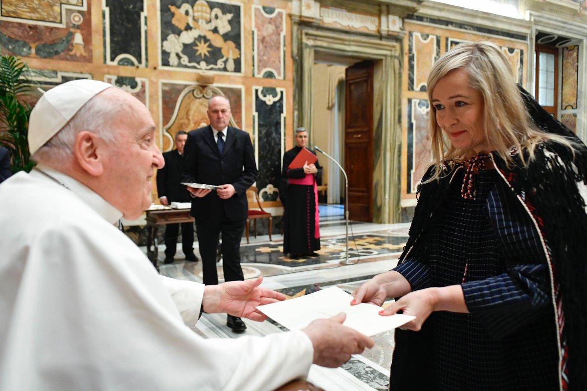
Talk about multi-tasking. Tara Morton (AAS, Fashion Design, ’14) is New Zealand’s ambassador to Spain. She was recently appointed ambassador to the Holy See as well and was greeted by Pope Francis. Ambassador Morton is also accredited to Andorra, Malta, Morocco, and has had postings in New York, Cairo and Baghdad. “Every day is different,”…
Blog Topics
Subscribe via Email
Latest Comments
All of the hats are beautiful! I love the Royal Ascot hat! I’m sure if Henry Higgins saw it he…
What a delightful story! Thank you for posting it. Warm regards, Kim
Archives
Connect With Us
School of Art and Design
Art and Design Gallery
The opinions expressed by FIT bloggers and commentary are theirs alone, and do not necessarily represent the views or policies of the Fashion Institute of Technology or its employees. The Fashion Institute of Technology makes no representations about the accuracy of the information presented in its blogs.
Azhelle, So very proud of you and your success. Watching you grow and thrive while at FIT, there was no…