FIT School of Art and Design
-
Effective Packaging Design Needs Good Surveying and Research
When it comes to packaging design, looking great and protecting the product are only a couple of the design goals. The package also has to attract the target audience, the potential buyers. At one point for instance, it seemed that those looking for “fair trade” food products were more attracted to labels showing photos of…
-
Tara Morton: Fashion and Diplomacy, Perfect Together
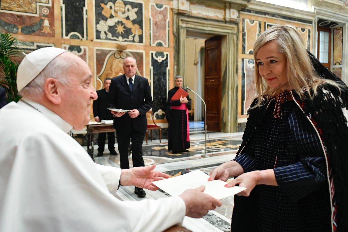
Talk about multi-tasking. Tara Morton (AAS, Fashion Design, ’14) is New Zealand’s ambassador to Spain. She was recently appointed ambassador to the Holy See as well and was greeted by Pope Francis. Ambassador Morton is also accredited to Andorra, Malta, Morocco, and has had postings in New York, Cairo and Baghdad. “Every day is different,”…
-
John Jay Cabuay Pictures What Kids Ask Ruby Bridges

Iconic activist Ruby Bridges has a lot to say about civil rights. A six-year-old second grader in 1960, she was the first and only Black student at William Frantz Elementary School in New Orleans. In fact, she was the only student, period. The day she arrived, surrounded by federal marshals, parents withdrew their 500 children…
-
Merry Christmas from the School of Art and Design!

This GIF is for you! It was created by Damaris Chamorro, ’24, in Prof. Anthony Capparelli’s Pictorial Problem Solving class. For a holiday card assignment, students learn to add movement and motion to their work. Chamorro, a recipient of The School Art League Trustrees Award, enjoys working with mediums that include drawing, painting, photography and mosaics…
-
… And He Scores! Professor Capparelli and the NHL

For Illustration Professor Anthony “Tony” Capparelli, the National Hockey League is a passion, but you won’t find him on the ice! He’s been dubbed “The Michelangelo of the Meadowlands” by hockey historian Stan Fischler and has been described as “the world’s most diverse sports artist.” The NHL has been keeping Prof. Capparelli busy. He recently…
Blog Topics
Subscribe via Email
Latest Comments
What a touching story! I am about Ruby Bridges’ age and in school we learned about Norman Rockwell’s sentimental paintings…
I hope Ned wasn’t a goalie!
Archives
Connect With Us
School of Art and Design
Art and Design Gallery
The opinions expressed by FIT bloggers and commentary are theirs alone, and do not necessarily represent the views or policies of the Fashion Institute of Technology or its employees. The Fashion Institute of Technology makes no representations about the accuracy of the information presented in its blogs.
What a delightful story! Thank you for posting it. Warm regards, Kim