
My Histogram/Column Chart is not looking like yours! What did I do wrong?
Answer: You probably did nothing wrong if everything looks the same except for the horizontal axis of your chart. Google will randomly make “updates” or changes. It seems they did on at the end of February/beginning of March. For some reason someone at Google thinks it looks better this new way (where sometimes all the bars are not labeled). That is fine but you can go in and play around to add more labels to the bars!
You do not have to worry about having each labeled but here is one way to do it: * I used a random student’s spreadsheet from 2014. * Make sure the chart is moved to its own sheet. There is a Course FAQ post on that too!
This is what their original chart looked like:
 If you put your mouse on the horizontal axis you will get to edit those numbers. It will turn a shade of gray.
![]() Then a little box will pop up where you can type the numbers you want to start and end.
Then a little box will pop up where you can type the numbers you want to start and end.
 This is one way to play around with that axis. I went a bit further. You can also click on “Advanced Edit”.
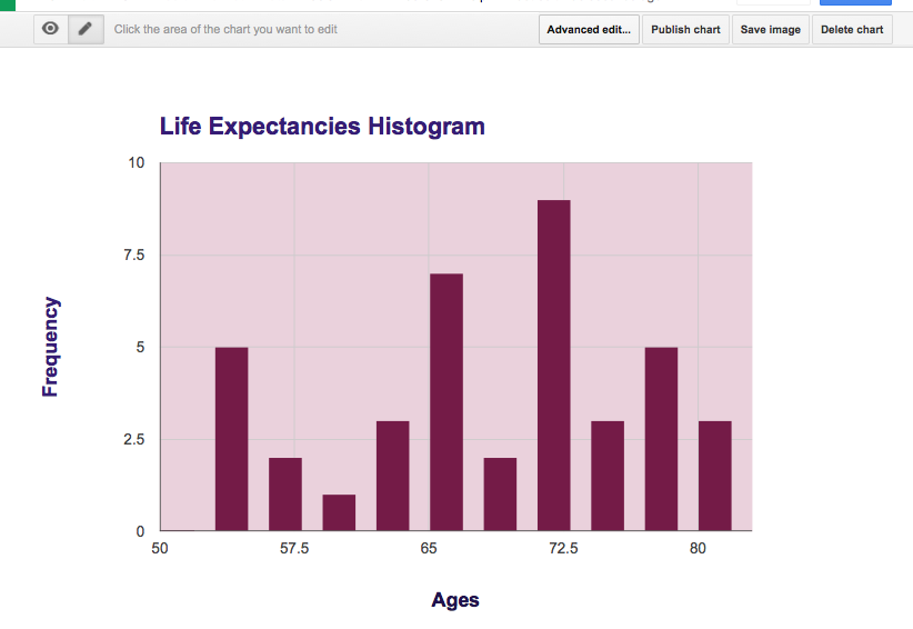 Once you click on Advanced Edit look down to the horizontal axis section. There is a part called Gridlines. I changed it to 10. Yay! Now it looks MUCH better. Still not what we used to have but an improvement.

Now Click Update:
