
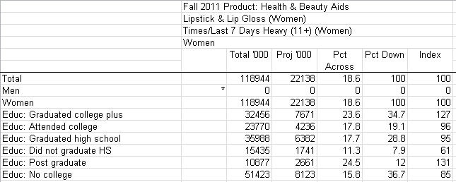
Would you like to turn this . . .
. . . . into this?

Video of making an infographic with Infogr.am
Back in September 2012, I wrote about the ready-made infographics that can be found in library databases like Mintel. Since the time I posted that blog entry, both Hoovers and Business Insights Essentials have added some nice new data visualizations and interactives to their services. Clearly, the database companies that serve industry are getting the message that effective visual communication is highly important in today’s business environment.
But while many industry and market research databases are adding visuals (or at least making graphics easier to locate), business researchers are still more likely to encounter statistics and demographics in the form of raw data. That’s why, if you’re a business major trying to give this information full impact in a presentation, you might be interested in some of the free DIY infographic and data visualization tools that are available on the web. Here are some of my personal favorites:
- Infogr.am – Very easy to use and very clear navigation.
- Visual.ly –
Also easy to use, if you can figure out what to click on to begin the process. The folks at Visual.ly have created a navigation that leads you back to their fee-based services, unless you know where to click. After logging in don’t click “Create.” Instead click “Marketplace” and then click the pink “Start Project” button on the upper rightVisual.ly has changed considerably since my posting. It is now mainly a commercial site connecting designers with clients. There are a few “instant” infograhic tools left, which are easiest to get to if you use the following address: http://create.visual.ly/ You might want to use Piktochart or Easel.ly as an alternative - Many Eyes – A little more finicky than the others, but worth it. Many Eyes from IBM allows you to create interactive data visualizations as well as textual analysis charts. It also includes a lot of useful information about what types of charts or graphs to use for various purposes.
- Piktochart – A much richer selection of options than is offered for free from Infogr.am and Visua.ly. Includes graphics and templates that are useful for expressing qualitative information.
These services make it relatively easy to create informative and compelling visualizations of both numeric and non-numeric information. All of them allow for uploading data sets for the creation of charts and images for use as illustrations. Many Eyes also allows for the upload of text for the creation of Word Clouds, Word Trees and other interactive visualizations. Also of note are Wordle, Google Charts and the more complex Google Fusion Tables (which is still in beta).
Like anything DIY and free on the web, these infographic tools are no match for the services offered by skilled graphic or communication designers. Even though these online services can produce something eye-catching rather quickly, using them well still takes time and some basic visual literacy.
If you need evidence of the rising interest in visual literacy and visual communication in the business world, a quick search of Business Source Complete will bring back a wide assortment of articles advocating visual thinking and visual language curricula for students in business programs. I thought I would include a link to a recent article from the Global Journal of Business Research as an example.
Siu-Kay, Pun. “Visual Language Skills – Do Business Students Need Them.” Global Journal Of Business Research (GJBR) 4.2 (2010): 85-96. Business Source Complete. Web. 5 Apr. 2013.